Case study · Enterprise product design · Fleet telematics
FleetTrack
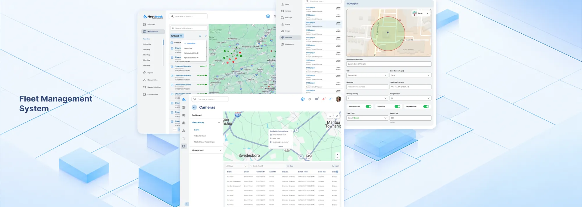
One workspace where a fleet manager can find a problem, see why it happened, and close it.
- Role
- Senior Product Designer
- Scope
- Dashboard redesign: fleet, vehicle, trip, event, and action
- Timeline
- 4 months · 2025
I redesigned the FleetTrack dashboard to connect fleet visibility, vehicle context, events and actions in one experience.
The data existed. The experience was fragmented.
01
Information was scattered
Fleet status, trips, events, reports and supporting information appeared in different parts of the experience.
02
Context was disconnected
A manager often had to connect information from multiple views to understand what had happened.
03
The interface had grown complex
The existing product needed a cleaner, more consistent experience as the amount of information and functionality increased.
The redesign was about connecting context, not adding more data.
From screens to a connected workflow
- Fleet
- Vehicle
- Trip
- Event
- Action
Instead of treating the dashboard as a collection of separate screens, I designed the experience around how a fleet manager moves from an overview to a specific vehicle, then to an event, its context, and the next action. Vehicle and trip both sit inside Locate, so the five levels show up as four moments: see, locate, understand, and act.
01
What needs my attention?
02
What happened, and where?
03
What should I do next?
I worked with the business analyst, project manager, developers and product leadership to understand the issues being raised by customers and translate them into product and UX decisions.
One workflow, four moments
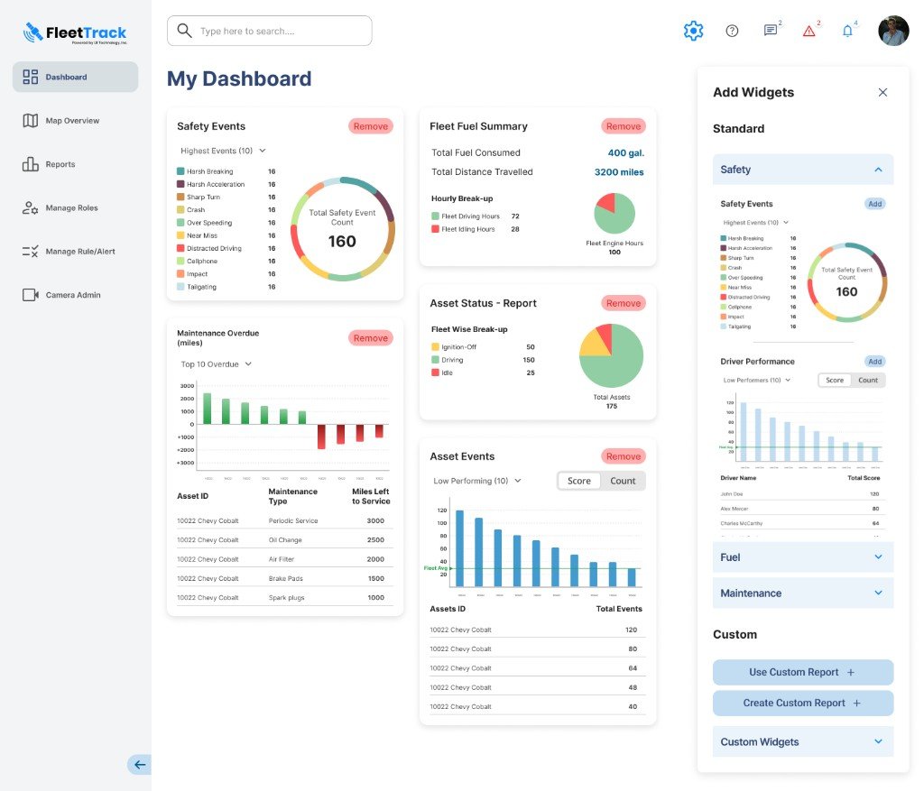
01 / See
Start with the fleet
The dashboard brings key operational information into one starting point and lets managers shape what they need to see.
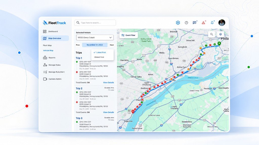
02 / Locate
Find the vehicle
Fleet status and location are connected so the manager can move from an overview to a specific vehicle without losing context.
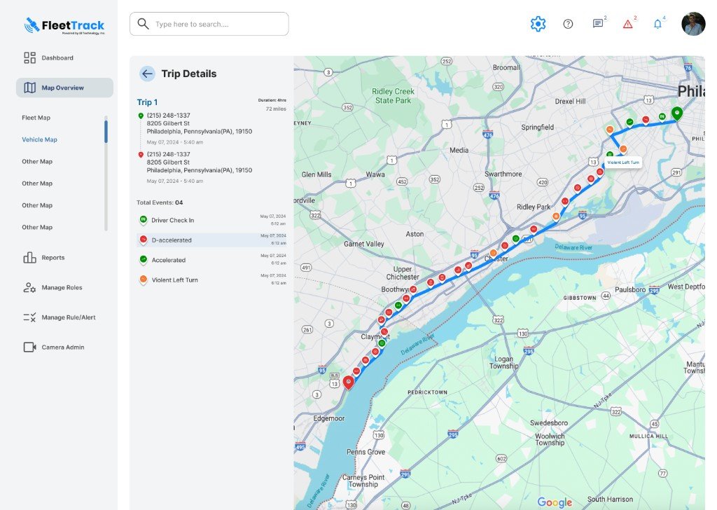
03 / Understand
Put the event in context
Events become meaningful when they are connected to the trip, route and surrounding vehicle information.
04 / Act
Take action from the same place
The vehicle panel brings the relevant information and available actions together, reducing the need to jump between tools.
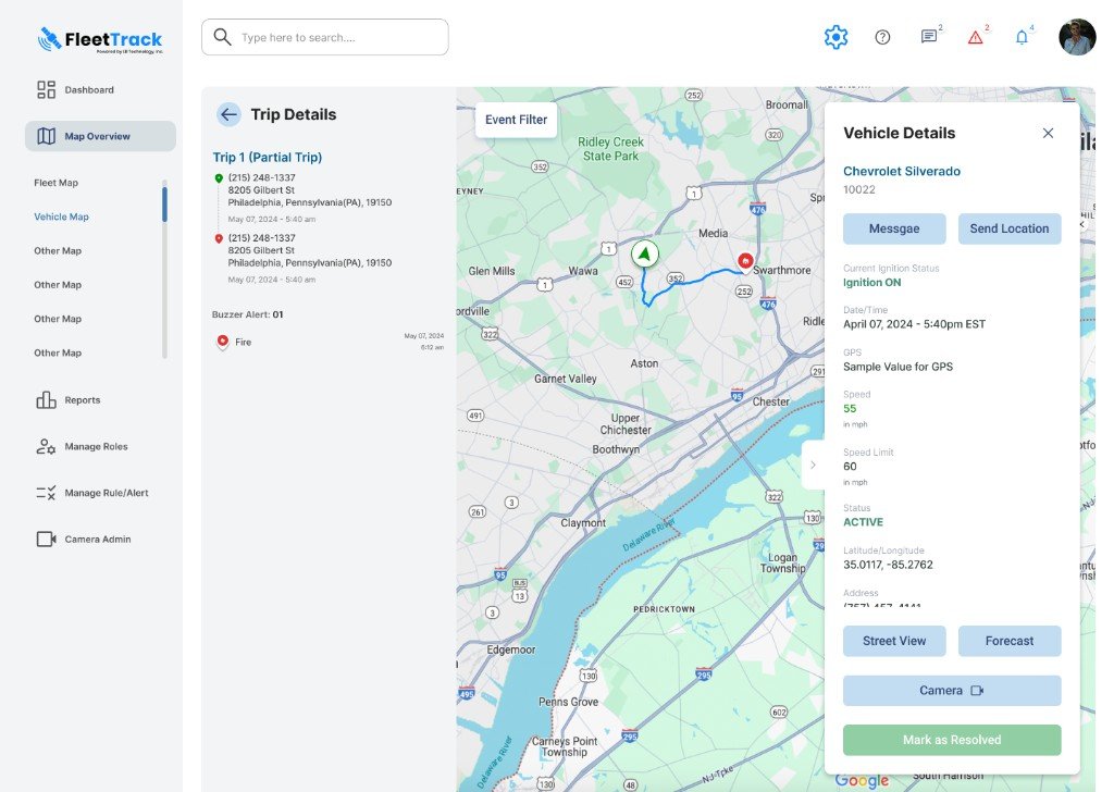
See it → locate it → understand it → act
A shared language for FleetTrack.
UI kit
A reusable kit, extended from the existing FleetTrack brand.
Vehicle iconography
One icon language so vehicle types stay recognisable across lists, maps and vehicle views.
One system, different fleet needs
Flexible layer
- Widgets
- Reports
- Operational views
Different fleet operators may care about different information, but the core interaction model stays consistent. The dashboard can adapt without creating a different product for every fleet.
The result
01
One workflow
An event now sits with its trip, route, and vehicle context, instead of a row with no place attached.
02
One dashboard
Safety, fuel, maintenance, and asset status share a starting screen, instead of a separate report for each question.
03
A report that stays
A report the manager built can stay on the dashboard as a tile for the next morning.
There was no analytics baseline for this project, so I'm not claiming performance numbers. The notes above are changes in the product. Proposals I'd track next, not results: time from alert to resolution, the share of events closed in the panel, and how often widgets are configured.
Next case study